Exercises

Jennifer Tan Qing Ni
Typography
Exercises
LECTURES
Lecture 1: Introduction to Typography
29.8.2018 (Week 1)
This week was the first typography class. So Mr Vinod and Mr Shamsul first talked us through the module and what we have to do, from our projects to how to document our progress on our blog.
We were told that our blog is very important and that theres a specific layout we have to follow. After that, Mr Vinod gave our first lecture.
Typography has been evolving for over 500 years, from calligraphy to lettering to finally-Typography. Like many crafts, it has its own set of terminologies, conventions and unwritten rules. Talking about all this, What even is typography? Typography (according to wikipedia) is "the art and technique of arranging type to make written language legible, readable, and appealing when displayed". The word 'typography' can also be used when describing the style, arrange and the appearance of the letters, numbers and symbols created in the process.
There are some important terminologies when understanding typography.
Font: A font refers to the individual font or weigh within the typeface, eg: Georgia Regular, Georgia italic and Georgia Bold
Typeface: A typeface refers to the entire family of fonts that share similar characteristics. Eg: Georgia, Arial, Times New Roman, Didot and Futura.
Type family: a type family refers to the many weights within an individual typeface.
Lecture 2: The basics / Describing Letterforms
5.9.18 (week 2)
Because typography has evolved for 500 years, it has a number of technical terms. Knowing them makes it easier to identify the specific typefaces.
Baseline: the imaginary line the visual base of the letterforms
Median: The imaginary line defining the x-height of letterforms
X-Height The height in any typeface of the lowercase 'x'

- Stroke
- Apex/Vertex
- Arm
- Ascender
- Barb
- Beak:
- Bowl
- Bracket
- Cross Bar
- Cross Stroke
- Crotch:
- Descender
- Ear
- Em/en:
- Finial
- Leg
- Ligature
- Link
- Loop
- Serif
- Shoulder
- Spine
- Spur
- Stem
- Stress
- Swash
- Tail
- Terminal
The font
The full font of a typeface contains much more than just 26 letters to numerals and a few punctuation marks.
- Uppercase: Capital letters including certain accented vowels
- Lowercase: includes the same characters as uppercase
- Small capital: Uppercase letters are drawn to the x-height of the typeface while small caps are normally four in serif fonts as part of what is called the expert set
- Uppercase Numerals: Aka Lining Figures. These numbers are the same height s uppercase letters and are all set the the same kerning width
- Lowercase numerals: aka old style figures or text figures, these numerals are set to x-height with ascenders and descenders.
- Italics: Small caps are almost alway roman. It refers back to the 15th century Italian cursive handwriting.
- Punctuation, miscellaneous characters: All fonts contain punctuation marks while miscellaneous characters can change from typeface to typeface.
- Ornaments: used as flourishes in invitations or certificates. Usually provided as a font in a larger typeface family.
Basic typefaces
Roman: called Roman because the uppercase forms are derived from inscriptions of Roman monuments
Italic: Named for the 15th century Italian handwriting on which the forms are based.
Boldface: Characterised by a thicker stroke than a roman form.
Light: A lighter stroke than the roman form. Even lighter strokes are called thin.
Condensed: A version of the roman form, and extremely condense styles are often called 'compressed'
Extended: An extended variation of a roman font
Week 3: No lecturers this week.
Lecture 4: Development / Timeline
Early letterform development: Phoenician to Roman
In the past, before the development of paper and pen, writing meant using a chisel scratching onto wet clay with a sharpened stick. At their core, uppercase forms are simple combination of straight lines and pieces of circles, as the materials and tools fo early writing required.
The Early Developments of Phoenician to Roman
Phoenicians like other Semitic people, wrote from right to left but the Greeks developed something called 'boustrophedon' which is the direction of writing from left to write, thus changing the direction of writing. 'Boustrophedon" literally translates to how the ox ploughs so the lines of text read alternately from right to left and left to right. Changing the direction of writing and reading also changed the orientation of the letterforms.


 A more compressed version of square capitals, rustic capitals allowed for twice as many words on a sheet of parchment and took far less time to write. The pen was or brush was held at an angle of approximately 30 degrees. Although easier and faster to write, they were slightly harder to read because of it being too compressed.

Both square and rustic capitals were typically only used for special document. Normally for everyday transactions, the cursive hand is used for the benefit of speed.

Uncials incorporated some aspects of the Roman cursive hand, especially in the shape of A, D, E, H, M, U and Q. 'Uncial' is the Latin for a twelfth of anything, some scholars think that uncials refers to the letters that are one inch (one 12th of foot) high.

Then the cursive hand further formalised, half uncials mark the formal beginning of lowercase letterforms, replete with ascenders and descenders, 2000 years after the origin of the Phoenician alphabet.
Charlemagne was the first unifier of Europe since the Romans, issued an edict in 789 to standardise all priestly texts.

Blackletter
In Northern Europe, a condense strongly vertical letterform known as Blackletter or texture gained popularity. In the south, a rounder more open hand gained popularity, called 'rotunda'.

Gutenberg's knew engineering, metal-smithing and chemistry. He brought together all his skills to mimicked the work of the scribe's hands -Blackletter or Northern Europe. His type mould require a different brass matrix, or negative impression, for each letterform.

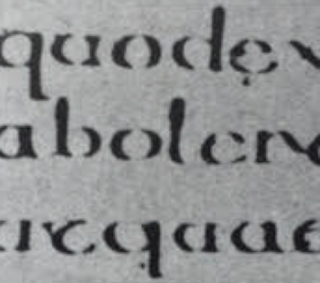
 |
| Figure 4.1 Evolution from Phoenician Letter. |
Phoenicians like other Semitic people, wrote from right to left but the Greeks developed something called 'boustrophedon' which is the direction of writing from left to write, thus changing the direction of writing. 'Boustrophedon" literally translates to how the ox ploughs so the lines of text read alternately from right to left and left to right. Changing the direction of writing and reading also changed the orientation of the letterforms.

Etrucsan (and the Roman) carvers working in marble painted letterforms before inscribing them. Certain strokes change in terms of weight from vertical to horizontal, a broadening of the stroke at start and finish -carried over into the carved letterforms.

Hand Script from 3rd - 10th century CE
Square capitals were the written version that can be found in Roman monuments. Their letterforms tend to have serifs added at the end of the main strokes. The strokes were achieved by the reed pen that held at approximately an angle of 60 degrees off the perpendicular.


Both square and rustic capitals were typically only used for special document. Normally for everyday transactions, the cursive hand is used for the benefit of speed.

Uncials incorporated some aspects of the Roman cursive hand, especially in the shape of A, D, E, H, M, U and Q. 'Uncial' is the Latin for a twelfth of anything, some scholars think that uncials refers to the letters that are one inch (one 12th of foot) high.

Then the cursive hand further formalised, half uncials mark the formal beginning of lowercase letterforms, replete with ascenders and descenders, 2000 years after the origin of the Phoenician alphabet.

Charlemagne was the first unifier of Europe since the Romans, issued an edict in 789 to standardise all priestly texts.

Blackletter
In Northern Europe, a condense strongly vertical letterform known as Blackletter or texture gained popularity. In the south, a rounder more open hand gained popularity, called 'rotunda'.

Gutenberg's knew engineering, metal-smithing and chemistry. He brought together all his skills to mimicked the work of the scribe's hands -Blackletter or Northern Europe. His type mould require a different brass matrix, or negative impression, for each letterform.

Week 5: There were no lectures this week.
Week 6: There were no lectures this week.
Instructions
Exercise
Calligraphy
(Week 1-Week 3)
For the first week, we were introduced to calligraphy. We were first told to get our calligraphy pens, either 3.0 or 4.0, either slanted or straight. Then we were told to write horizontal, vertical, circular strokes so we can get used to and get familiar with the pen. Below were the practices.
 |
| Figure 1.1 horizontal lines attempt 1 |
 |
| Figure 1.2 horizontal lines attempt 2 |
 |
| Figure 1.3 circular strokes attempt 1 |
 |
| Figure 1.4 2nd attempt on my circular strokes |
 |
| Figure 1.5 Vertical strokes |
After my first attempt, I was told that the strokes were not consistent. The circular strokes were suppose to touch 4 corners for a more consistent and neat look. So I took that into account for the second attempt.
 |
| Figure 1.6 First attempt |
 |
| Figure 1.7 2nd and final attempt |
After we've done our strokes, we then move on to the next step of our calligraphy exercise. So we were given a few options to choose from, chancery, uncial, Roundhand and Blackletter and we were told to choose one of the few that we were most comfortable with. I decided to go with Blackletter as I found it the most interesting and beautiful out of the options. So I first looked for the blackletter lettering guide so I can see how to actually master it. After that I started to practice on graph paper.
 |
| Figure 1.8 Blackletter guide |
 |
| Figure 1.9 Practices |
 |
| Figure 1.10 Practices #2 |
After that I started to do the letters from A-Z all on 4 graph papers
 |
| Figure 1.11 A-H |
 |
| Figure 1.12 I-P |
 |
| Figure 1.13 Q- X |
 |
| Figure 1.14 Y-Z |
 |
| Figure 1.16 Attempt 2 |
 |
| Figure 1.15 Final |
Lettering
(Week 4-Week 5)
For this exercise, we moved on to lettering. So this tme, we were told to sketch out ideas for our names that reflects our personalities. I first did some sketches. I wanted to portray my bubbly personality.
 |
| Figure 2.1 |
 |
| Figure 2.2 2nd attempt |
 |
| Figure 2.3 3rd and final attempt |
 |
| Figure 2.4 The chosen one |
I then moved on to digitalising it.
 |
| Figure 2.5 The digitalised version |
 |
| Figure 2.6 the process |
 |
| Figure 2.7 The bubble blowing which I didn't thought it would work out |
I then thought about another idea, to make them float away like balloons. Personally, animating it was really a big struggle for me. It took at me at least 6-7 attempts in order to get it correct. The first 4 times, I kept making mistakes as all of words kept moving. At first, I thought a smooth animation required loads of frames, so my for my 5th attempt, I had over 200 frames, which made the animation really really slow and it was also going in reverse, which is a big error there
 |
| Figure 2.8 200+ frames |
 |
| Figure 2.9 The outcome |
 |
| Figure 2.10 Still trying to decrease the frames |
So for my final attempt which was my 8th attempt, I was only left with around 30-40 frames which was my final.
 |
| Figure 2.11 |
 |
| Figure 2.12 Final Outcome that describes my bubbly and fun personality |
Week 5 - Week 6
This week, we were introduced to type expressions where we have to express the words itself by using the power of typography. We were given 6 words to express it.
- Sparkle
- Float
- Blur
- Heavy
- Tall
- Rage
Below is my first attempt.
They were quite a lot of errors in my types expressions. The 'float' had too much graphic elements to support the type expressions. The 'blur' looked more noisy rather than being what its suppose to mean. The 'heavy' looks like its falling rather than being 'heavy'. 'Tall' didn't work mainly because I repeated the TA too much. 'Rage' was okay. |
| Figure 3.1 First attempt at Type Expressions |
Then I went ahead and redid it again.
 |
| Figure 3.2 2nd Attempt |
 |
| Figure 3.3 Recorrecting the 'Heavy expression' |
This was the approve version of heavy.
 |
| Figure 3.4 The final outcome. |
 |
| Figure 3.5 Screenshot |
 |
| Figure 3.6 Screenshot |
Below is the outcome.
 |
| Figure 3.7 outcome of the animation |
I then figured that my lecturers weren't really satisfied with the outcome of my 'sparkle' gif so I went ahead to do the animation using 'heavy'. For 'heavy' I used about 10-20 frames to animate 'heavy'
 |
| Figure 3.8 Process of animating Heavy |
 |
| Figure 3.9 Animating Heavy |
 |
| Figure 3.10 Final Animation of Heavy |
FEEDBACK
week 1
Mr Vinod said that my overall strokes were not that incosisitent . My horizontal and vertical strokes needed some gaps in between, gaps that are the size of the pen width. Also, my circular strokes were not consistent. I was thought, to have a more consistent stroke, the strokes should touch all 4 corners of a box. I was then told to go back and practice a little bit more and that its better if I did the practices agian cuase of after practice makes perfect.
week 2
Mr Shamsul said the letters like the letter 'b' or ' d should have a smaller gap (size of the nib of the pen). He said some of my alphabets looked fine and consistent but i should practice to make a smaller gap in for the letters. About the quote/sentence, he said that the space in between the 2 sentences was too far away from each other and that it should be closer. The gap between the words should also have a more consistent gap.
week 3
Mr Shamsul critiqued about my practices, and he said the spacings in between should be the size of the nip of the pen. My spacings between each letter was not consistent. Some were too close while some were too far apart, so I should practice more. On the same day, I took the feedback and wrote the letters again but this time with a 1 block space in between the spaces and Mr Shamsul was more happy with it and that I should move on with my quote.
week 4
I first showed Mr Vinod my quote (calligraphy). He said its good and okay but spacing between letters could be better and that my capital letter should also be a little smaller so that its more balanced. After that, for the type expression of my name, he said that my lettering didnt really the potray the personality I was going for. So for my 1st attept, Mr Vinod commented on how my letterings were a little too crude and the letters not being obvious enough. For my 2nd attempt, Mr Vinod said that it was on the way on looking better but still it didnt look presentable enough and that I should do some research on bubbles. For my 3rd and last attempt, after digitalizing it, Mr Vinod said that the words had too much of the reflections and that I should take some of the completed digitalized lettering.
week 5
Mr Shamsul said that some of the words don't really represent the word itself. To be more specific, 'blur', 'heavy', 'tall' and 'rage'. So I redid some of them. Both Mr Shamsul and Mr Vinod also said that I relied on too much graphical elements on each word that its too dependent on the elements (on 'sparkle and float'), and that I should use less of them. My 'blur' also looked more noisy than what its suppose to be 'blur'. The 'tall' didnt look correct as I put too many 'TA's in the beginning. After some corrections here and there, they were then okay with it, although there are still some elements that didn't need to be used.
week 6
Mr Vinod didn't really approve of my 'sparkle' animation because of his reaction. I was told that there were still too much graphical elements in the animation and that its not a good one. Other than that, there weren't anything else.
OBSERVATIONS
Week 1
I realised most of us (including myself) were quite eye opened to the world of typography.
Week 2
In this week, I saw that our class was quite flustered with the calligraphy work.
Week 3
This week, I realised we are more comfortable and more used to the calligraphy work as we got more used to the feel of the calligraphy pen.
Week 4
I found out that all of us have very different ways and styles on expressing their names.
Week 5
I saw a lot of my classmates animation and I found them all very unique int their own way
Week 6
I realised that a lot of us struggled a lot with the type expressions, as it doesn't look like what the world we are trying to describe
FINDINGS
Week 1
I found out that theres so much more to typography than just letters and words.
Week 2
I realised that little elements like spacing and thickness of a stroke is very important when it comes to calligraphy. Patience also plays a key role to perfecting calligraphy.
week 3
I found out that consistency is key when it comes to calligraphy
Week 4
Applying a personality on my name is not as easy as I thought it would be
Week 5
I found out that animating is a very lengthy process and it requires a lot of focus to do so.
Week 6
I found out that when creating a type expression, I rely too much on graphical elements to make it look and feel like what it should mean
REFLECTIONS
Week 1
I realised that typography isn't just about words and letters, its about how you emotions or other things into a word form
Week 2
I was partially confused about the work where we need tor write strokes but I then found out that I got more comfortable with the pen, the more practice I do
Week 3
I realised that, the more focus and patient I am, the better my calligraphy work.
Week 4
I'm starting to feel the pressure of the typography class
Week 5
When animating the my name, I became really stressed out with the amount of times I failed in making the animation work.
Week 6
I found the type expressions harder than it looks and I was really flustered.
Further Reading
Writing Systems and Calligraphy of the world by Jessica Bordeau
week 1
Typography has no rules. Nowadays, most of us are using the Latin alphabets. But there are many more other writing systems around the world and they are really unique in their own way.
Chinese
Chinese characters are normally symbols and they don’t compromise an alphabet. A system called Logo-syllabic is used, which is when each character generally represents either a complete one-syllable word or a single-syllable part of a word. Each character has its very own pronunciation and theres no guessing needed. In order to be able to speak in chinese, there are about 4000 characters that needs to be memorised which is a lot. Because many commonly used Chinese characters have 10-30 strokes, certain strokes orders have been recommended to ensure speed, accuracy and legibility in composition
Japanese
Japanese has a much different writing system that is, syllabic, which means that each symbol represents a syllable. By combining it together it forms words. Man’yōgana, was the first full fledged script for written Japanese and its a really old writing system that uses Chinese characters to represent the Japanese language.
There are 3 main scripts for the modern Japanese writing system
Kanji, which is used for nouns and stems of adjectives and verbs
 |
| Figure 1.1 Kanji |
Hiragana, which is used for native Japanese words and written in the highly cursive flowing sōsho style
 |
| Figure 1.2 Hiragana |
Katakana, which is used for foreign borrowings and was developed by Buddhist monks as a shorthand.
 |
| Figure 1.3 Katakana |
In Japan, cursive scripts has traditionally considered more suitable for women those its called women’s script or onnande while clerical style has been considered suitable for men and was called men’s script or otokade.
Korean
Koreans uses a much more different writing system called Hangul. It has existed since the middle of the 15th century but it wasn’t popular until 1945 where Koreans started utilising them. This is because of tradition and scholar continued to use classical Chinese as their literary language.
 |
| Figure 1.4 Hangul |
https://www.smashingmagazine.com/2010/05/the-beauty-of-typography-writing-systems-and-calligraphy-of-the-world/


The Evolution of Typography: A Brief History by John Siebert
week 2 - week 3
Writing. Its the most crucial and basic form of communication and it traces back to when ancient civilisation use hieroglyphs or pictograms to represent ideas, which then soon evolved to alphabets and phonographic writing, which then led to to the development various typographic systems.
Ancient era
Ancient cave paintings are perhaps the very first recorded written communication which dates back to 20000 BC but formal writing is said to have been developed by the Sumerians at around 3500 BC. As humans became smarter and more advanced, the need to communicate grew, thus the Egyptians developed the hieroglyphics in 31000 in which they incorporated symbols or ideograms into their art, architecture and writing.
On the other hand, Phoenicians started to develop phonograms or symbols used to represent spoken words aorund 1600 BC. They are the one responsible for creating the very first alphabet around 1000 BC, the same alphabets the Greeks used. As a matter of fact, the word Alphabet is a combination of the first 2 Greek letters, Alpha and Beta.
Several year later, The Romans used the Greek Alphabet which is still in use now.
Middle Ages
During the middle ages, it was all about hand-written manuscripts. Uncials and half uncials were the most well known features with rounded elaborate lettering. The art of Calligraphy along with page layout and lettering forged new ground.
 |
| Figure 2.1 |
Gutenberg and Modern Typography
Johannes Gutenberg developed the moveable type and the printing press in 15th century which was a turning point for the modern world in which that was the starting point for modern typography. By the time of the Industrial Revolution, typography was seen on most forms of visual communications, like signs, posters, newspapers, periodicals and ads. As time progresses, typefaces became better, larger and catchier. Ornamental typography was also used to make posters look more attractive.
Nowadays, typography is used everywhere. Modern technology is easily accessible now so graphic designers can easily create a range of typographic styles or type families using the luxury tools and technology.
http://www.printmag.com/typography/evolution-typography-history/

How Typefaces Influences Perception and Persuasion by Michael Del Gigante
week 4
Words can make a big impact, but so can typefaces but in a more subtle and subliminal way. There have been a few experiments that were conducted and some have proved how typefaces can affect the way people read.
An experiment was conducted, which was for another purpose but then It was later revealed that the article was presented in different typefaces: Baskerville, Comic Sans, Computer Modern, Georgia, Helvetica and Trebuchet. And the tire purpose of the experiment was to see which font inspire the most confidence in the results of the research, as well as which fonts weakened the credibility of the study.
After the experiment, 40000 readers took the quiz and apparently, Baskerville generated the greatest amount of trust while Georgia (which looked smiler) didn’t really score as much trust as Georgia did. Comic Sans caused many to ignore the results as it sparked a sense of disrespect in some readers. Baskerville has long been favoured by typographers as it clearly conveys information without distracting the reader with showy strokes, designs or heights. Its simple style allows the readers to unconsciously absorb information
Another experiment was conducted too see how fonts can affect a persons level of success. So, in 2006, a university student named Phil Renaud wrote 52 essays over the course of 6 semesters. His scores began to rise when going towards the final semester. But, the thing is, he didn’t really increase the amount of time or effort to put into his writing. All he id was just change the font of the his essays and he found out later that the papers that were written in the Georgia font earned higher grades than his earlier essays in Times New Roman and Trebuchet Ms fonts. Mr Renaud then concluded that Times New Roman was too common so it didn’t really stand out but Georgia which was quite similar to Times , minted its academic sense, yet different enough to be fresh and interesting to a weary professor. Why? A 1988 study from Carnegie Mellon revealed Tod ay that respondents strongly favoured Georgia because it was much easier to read and more aesthetically pleasing.
So you can see how typefaces can influences the readability of something. Thus we should remember that there is much more to fonts than meets the eye.
URL: https://www.mdgadvertising.com/marketing-insights/how-typefaces-influence-perception-and-persuasion

The Art of Chinese Calligraphy by Vision Times
week 5
Chinese Calligraphy in the Chinese culture, is not just a means of communication but also to express a person’s inner world in an aesthetic sense. Calligraphy in the ancient days was counted as a high esteem thus becoming an important part of Chinese culture in temples in palaces.
 |
| Figure 3.1 Chinese Calligraphy |
The ‘four treasures of study’ is need when practicing calligraphy which includes: a writing brush, an ink stick, paper and an ink slab. Calligraphy is not easy and it requires great concentration and focus to guide the soft writing brush charged with fluid ink, as the ink diffuses quickly once it touches the paper. Once the continuity of the brush movement is broken, it leaves a black mark instantly thus spoiling the work. So to master to this, speed, strength and agility is key.
 |
| Figure 3.2 The Four Treasures of Study |
It is said that calligraphy can compared with Tai Chi and Qigong in which a relaxed mind and focus is key. This is why calligraphers tend to forget their worries in themselves while practicing calligraphy as they are focusing all their thoughts into creating art, thus improving a person’s well-being.
Unlike other visual art techniques, all calligraphy strokes are permanent and bold, thus it demands careful planning and confident execution. Official and executives require these sets of skill. Calligraphy, like Tai Chi, is considered an active way of keeping one fit and healthy, for the practice is both relaxing and self entertaining.
URL: http://www.visiontimes.com/2017/06/20/chinese-calligraphy.html


When Typography Speaks Louder than Words by Carolyn Knight and Jessica Glaser
week 6
When communicating a message, there needs to be a balance between visual and and the verbal aspects of design. Thats why graphic designers tend to use typography expressions can be applied onto the text to convey the message. When it comes to professional graphic design, visual language means that something is created by the visual appeared of both text and image. While Verbal language literally mean the words, phrases and sentences used.
Manipulating Feelings and Reactions
In visual language, type doesn’t just make people feel but also trigger physical responses. Like this example below.
 |
| Figure 4.1 Hello #1 |
This illustration shows a single large bold world, set in lowercase and closely kerned. The positioning in the frame makes the world dominant and loud, and the message looks friendly, confident and enthusiastic. It feel like the person speaking is really willing to speak to you and is pleased to see, while having a big smile on their face.
 |
| Figure 4.3 Hello #2 |
While this illustration above has a big contrast compared to the 1st one. Although its the same meaning, but the choice of font, case, scale, colour and positioning just doesn’t feel the same like the first one but a distant and hesitant meeting and that you would rather be ignored than being greeted.
When you read the first one out loud, it would be loud and enthusiastic while the 2nd one will feel much more hesitant and will sound much more quieter. So this shows that the choice of font, composition, scale matters when it comes to transferring a message as each person has a different way of perceiving the message.
URL: https://www.smashingmagazine.com/2012/04/when-typography-speaks-louder-than-words/


Comments
Post a Comment