Final Project
Jennifer Tan Qing Ni (0333137)
Typography
Final Project
LECTURES
WEEK 11- There were no lectures as it was e-learning week
WEEK 12- There were no lectures this week. We continued with our final project.
INSTRUCTIONS
FINAL PROJECT
Week 11
For the final project, we were told to make an A3 size poster about the social flaws that we see in University, like smoking, littering, dirty toilets and others. The poster has to be in portrait mode and with a limit of black and white colours and one additional colour if wanted. This poster is to be made purely from typography, with only little graphical elements allowed. Our lecturers asked us to look up in Pinterest, to see how it should be done.
Week 10
I wanted to portray how students always have to rush again time to complete an assignment before the deadlines until they get so stressed.
Then, started to sketch of an idea that came to my head.
 |
| Figure 1.1 Sketch |
 |
| Figure 1.2 First attempt |
After I showed my lecturers, they didn't approve of it. I was told to do more research. Then I changed my idea for the social issue. Instead of time and deadlines, I decided to illustrate something related to littering.
 |
| Figure 1.3 Inspo #1 |
 |
| Figure 1.4 Inspo #2 |
 |
| Figure 1.5 Inspo 3 |
 |
| Figure 1.6 Inspo 4 |
 |
| Figure 1.7 Inspo 5 |
Then I started to sketch my idea out.
 |
| Figure 1.8 rough sketch |
 |
| Figure 1.9 Outcome 1st attempt |
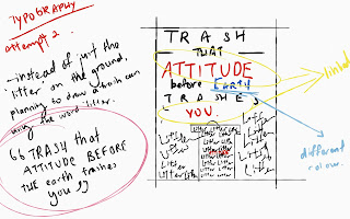
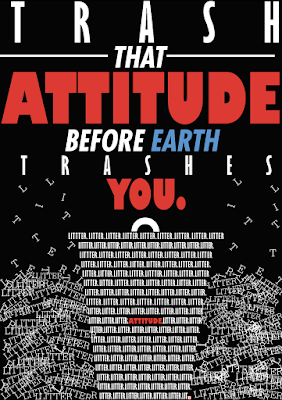
After showing Mr Vinod my work, he commented that I should try more variations and to focus on quality rather than quantity. Also, he commented on how I should also pay attention to the empty spaces. So after that I started to think, what could I do to enhance the design. So for my second attempt, I decided to make a shape of a dustbin, but being made out of the word "litter". Below is my sketch.
 |
| Figure 1.10 rough sketch for the 2nd attempt |
 |
| Figure 1.10 Attempt 2 |
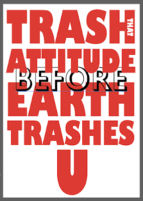
After seeing this, my lecturer didn't approve it. So he tried to give me a sense of what's more appropriate by doing an example for me.
 |
| Figure 1.11 poster example done by my lecturer |
 |
| Figure 1.14 5th attempt |
 |
| Figure 1.15 6th attempt |
 |
| Figure 1.16 7th attempt (final) |
 |
| Figure 1.17 Final Poster |
 |
| Figure 1.18 1st attempt |
 |
| Figure 1.19 Final |
FEEDBACK
week 11
There were no classes this week. So no feedback was given.
Week 12
For this week, our lecturers critiqued our blog. After that, we let him see our poster. My lecturers get the idea of it but its not good. So I was told to do research and sketch out my idea before doing it digitally.
Week 13
After my second attempt, it was too messy and is giving my lecturers a migraine due to the repetition of litter around the bin. Then after that, my lecturers gave me help by making an example. After trying it out on my own, my lecturers were fine with the poster, its just that the letters in the bin (5th attempt) was a little too clustered and a little bit messy that the letters can't be seen. For my 6th attempt, I used the letter "litter" and aligned it together in a neat way. Then my lecturers commented that it is too neat to be called 'litter' when litter is dirty and messy so for my 7th attempt, I decided to used the word 'litter' and garbage, and I placed it in different places and my lecturers were okay with it.
FINDINGS
Week 11
No classes
Week 12
This week, I found out that when it comes to a poster, nothing is really easy, as a lot of things has to be taken into account.
Week 13
When it comes to designing the poster, we should be thinking from the audiences point of view. A poster shouldn't be too complex till the point when the audience should think what it is about and should be straightforward
OBSERVATIONS
week 11
no classes.
Week 12
I found out that me and my classmates are really confused with the final project.
Week 13
I realised that our classmates has a better idea of what a poster should be like after the feedbacks we got from our lecturers.
REFLECTIONS
week 11
no classes
Week 12
I understood the assignment well but making the actual poster is not as easy as I thought it would be.
Week 13
When making the poster, I became more attentive to the posters around me and I actually paid attention to how people do it.
FURTHER READING
WEEK 11-13
Type Rules! by Ilene StrizverChapter 4 :Selecting the Right Type for the Job
Each and every typeface is different in their own way and it can convey a different mood or feel to the audience. Headline typefaces tend to make a stronger statement thus it tends to be stronger in personality. But it is not just selecting a typeface for display, there are certain factors that you have to look out for so that it can help you make the right choices.
- Design goal
Before selecting a typeface, we must first know the primary goal of the design. It is necessary to serve the client using your design and problem solving methods into designing a particular piece and you should never make it into your own personal design statement. Each and every job needs a different approach rather than just one. So this will call for different typefaces for each job. Eg: a travel brochure might need some exciting elements so the typeface can be more adventurous while textbooks might call for a more calm and pleasing typeface, ones that are readable and doesn't tire the eyes
- Identify your Audience
In order to attract people to see your poster, you must first understand the audience that you are targeting. This can be narrowed down to their age, interest, attention span and others. For example, when targeting children, they tend to be more attracted to fun and easy to read typefaces, those that just 'speak' to the kids while teens might like a more modern and aesthetic touch to their designs. Every group of people is unique in their own way like the typefaces, that's why It is crucial to choose a typeface that speaks to them, so that people would want to see what you have produced
- Type Size
Type sizes can change a readers perspective on reading. There are quite a few things that need to be reconsidered. Some things require the readers to read first so a larger size will be implied onto the sentence, making it the headlines of things.
- Type Colour
Colour picking is very important as we tend to choose the wrong colours that really affects the readability of the passages. Also If white or light coloured type is to be dropped out of a dark colour or image, then the weaker the design details rare.
- Paper and Surface Considerations
When selecting a typeface for printing, the type of paper may affect the quality of the print. This usually applies to to typefaces that has an extreme weight contrast with very thin strokes and is an extra light or ultra thin weigh. Some paper surfaces can alter the appearance and might even start to break it up.


Comments
Post a Comment