Project 1

Jennifer Tan Qing Ni (0333137)
Advanced Typography
Project 1
LECTURES
Lecture 6:
5th May 2019 | Week 6
This week, our classmates gave a presentation on Finding Inspiration: Typeface Design.
Below is the powerpoint presentation.
INSTRUCTIONS
PROJECT 1
7th May 2019 | Week 7
This week, Mr Vinod gave a brief on our 1st project. For our first project, we were required to create a key artwork that is something like our type and play exercise but with The Troublemakers Manifesto information.
The key to this key artwork is that it has to somehow have the vibe of a troublemaker.
I did my first attempt by doing a blind contour on photoshop. How I understood the term 'Troublemaker' was going against the rules of design. I decided to go with a blind contour because its art form is somehow free and quite the opposite of what is seen.
I first drew the portraits without looking at what I drew and instead just focus on their faces.
 |
| Figure 1.1 Process |
Then, for the background, I decided to add an old looking piece of paper, to kind of grasp that old book vibe.
 |
| Figure 1.2 Process |
Then I added the words of the event which is 'The Troublemakers Manifesto'.
 |
| Figure 1.3 Attempt 1 |
After my lecturers feedback, they agreed that it didn't really much capture the idea of a 'Troublemaker'. So I moved on to a different idea.
Week 8
I decided to play around with Malaysian culture. I went on Pinterest and searched up some inspiration . I really wanted my key artwork has a really traditional look. Below are just a few that I was inspired by.
 |
| Figure 1.4 Inspo |
 |
| Figure 1.5 Inspo 2 |
 |
| Figure 1.6 Inspo 3 |
I then looked for something unique that could represent a person being a 'Troublemaker'. While researching, I suddenly thought about a Chinese theatre mask, because I remember that they always looked kinda mischievous. So I did a little research on them.
 |
| Figure 1.7 Chinese theatre types of masks |
I found this website that explains Chinese theatre masks and each colour represented a different character. I then found out that the yellow mask represented it being the more sly and evil one. I decided that I would include that in my key artwork.
Other than just the mask, I tried to look for other folklores and I came across a famous Chinese story which is 'Journey to the West'. One of the characters, which is a monkey named Sun Wukong. Although he was smart, he was always seen as the mischievous one. I decided that I would combine the mask and body of a monkey to produce my key artwork.
I drew out the mask along with the monkeys body on photoshop.
 |
| Figure 1.8 Process |
 |
| Figure 1.9 Process |
 |
| Figure 1.10 Attempt 2 |
So I then tried to find some other mask from other cultures like the Hanumans and others and came across another one that symbolised being a troublemaker.
 |
| Figure 1.11 Hanuman Mask |
I started to draw it on photoshop.
 |
| Figure 1.12 Attempt 3 Process |
 |
| Figure 1.13 Attempt 3 Process |
 |
| Figure 1.14 Attempt 3 Process |
 |
| Figure 1.15 Attempt 3 (a) |
 |
| Figure 1.16 Attempt 4 (b) |
I then did my research again. I came across one of the orang asli tribes which is the Mah Meri. They have a traditional dance that uses wooden masks to portray the characters. One of them is the Moyang Pongkol and he's a very sly and mischievous characters. Below is the mask.
 |
| Figure 1.17 Moyang Pongkol |
 |
| Figure 1.18 The drawn Moyang Pongkol |
 |
| Figure 1.19 Attempt 3 outcome |

Mr Vinod commented that there was too much going on in one key artwork and that I should do something else. He suggested that I do something related to the 3 monkeys statue that says : hear no evil, see no evil, speak no evil.
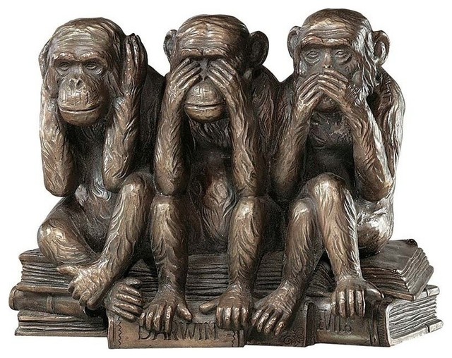 |
| Figure 1.20 3 wise monkeys statue |
At that moment, I didn't really like the monkey idea anymore and I wanted to see how I can portray the statue doing the exact opposite of what its suppose to do. So I went online to search for some inspirations.
After some digging, I was quite inspired by skulls protraying the 3 wise monkeys. They were mostly skull illustrations for tattoos but I found them really beautiful. Below are 2 that I were inspired by.
 |
| Figure 1.21 Inspo |
 |
| Figure 1.22 Inspo |
Then I started to look for some elements online that might help me in creating the key artwork. The key to making it different is that it has to do the opposite of the quote "hear no evil, see no evil, speak no evil". It should be 'Hearing evil, speaking evil and seeing evil', hence the title of this event: 'The Troublemakers Manifesto'.
 |
| Figure 1. 23 Skull |
 |
| Figure 1.24 Middle Finger |
 |
| Figure 1.25 Ear |
 |
| Figure 1.26 hands |
 |
| Figure 1.27 Skull with middle fingers on eyes |
 |
| Figure 1.28 censored middle finger |
Hear No Evil to Hearing Evil
 |
| Figure 1.29 Hearing Evil |
 |
| Figure 1.30 |
 |
| Figure 1.31 Final Attempt and Outcome |
FEEDBACK
Week 6
Online Feedback: I think you are almost there. I can see the characteristic as well as consistent look and feel in strokes.
This week the lecturers checked our blogs. My blog was overall okay. My type and play part 1 is accepted. For my poster, The 'empire' part is a little weird. Mr Shamsul gave me a suggestion of maybe masking some of the cloud out so that I can put it over the 'Empire'. He also said that i should take out the outlines for the 'of mind' as it looks a little too much and confusing. The lines thas going through the text could also be smoother and also the start of the lines, Mr Shamsul said that maybe i could let it fade in a little. But overall, my poster was fine.
Week 7
Week 8
Mr Vinod commented that it was too orientalised. It only represented one type of culture and that if I'm going with a traditional Malaysian look, I should include other cultures and other types of masks. I was told to go back and do some research on the types of masks each culture offers, like the orang asli or the hanumans. Week 9
Online Feedback: Can. Only our feedback to you was, to de-orientalise the look.There are Indian and orangasli monkeys too. After the above feedback, I tried to change my key artwork according to the feedback he gave. Then I let my lecturers check again. Mr Vinod commented that I kind of chose the wrong mask, as one of them was from a Thai culture and another was not so suitable for the key artwork. Too much was going on in one key artwork and it sort of looked too messy. He explained how there was no need of complex illustrations and that i should just go online and look for pictures and manipulate it on photoshop. Then, he gave me a suggestion on using The 3 Monkeys statues. After a long day of creating the key artwork, Mr Vinod said that it was good job and gave me a high five. Mr Shamsul told me to just arrange 'The' in a different way to make it less awkward.
FINDINGS
Week 6
This week, I found out that I take a very long time when it comes to thinking about a composition along with the quote. I really take more time than others.
Week 7
I found out that finding appropriate images is very important when interplaying between type and the image. Not all images can compliment what is needed to be portrayed.
OBSERVATIONS
Week 6
This week, I can see that my classmates are getting more confident and less scared when compared to last time.
Week 7
I realised that most of us were creating posters rather than key artwork due to us still being confused to what it actually is.
EXPERIENCES
Week 6
This week is really not my week. My productivity levels and motivation levels are getting lesser and lesser which is bad. I'm trying to pick myself up.
Week 7
I was still confused at what a key artwork was and I keep ending up creating a poster like image.
FURTHER READING
Week 6
Typography Sketchbooks by Steven Heller and Lita Talrico

In this book, Steve and Lita decided to study and compile the sketches of over 70+ designers.
I decided to look at some that I thought was interesting.

The one above here is by Don Ryun Chang whoms a designer from South Korea. He studied in New York so he has sketchbook that date backs to several decades. He is often transfixed by his sketch work. He describes it having human elements which is expressed in crooked, non uniform lines. The pictures are exploratory sketches.
 |


Comments
Post a Comment